
AUTODOC
Hands & Heart: A wayfinding system for AUTODOC’s new home
Modular wayfinding and spatial branding for Europe’s leading automotive parts platform, designed around the culture of making, fixing, and movement.
space
4000 m² office / workplace
client industry
E-commerce
Location
Berlin, Germany
Sentiform Deliverables
Wayfinding Strategy, Wayfinding Design, Signage, Environmental Glass Graphics, Spatial Branding
Year Completed
2026
CLIENT TEAM
Kris Sharygina, Anastasiia Karpeeva (Workplace Experience)
Project Photography
Sabīne Zoltnere


AWARDS

European Wayfinding Awards 2026
Best Wayfinding for Workplaces GOLD
Project Overview
A workplace shaped by the culture of making and fixing
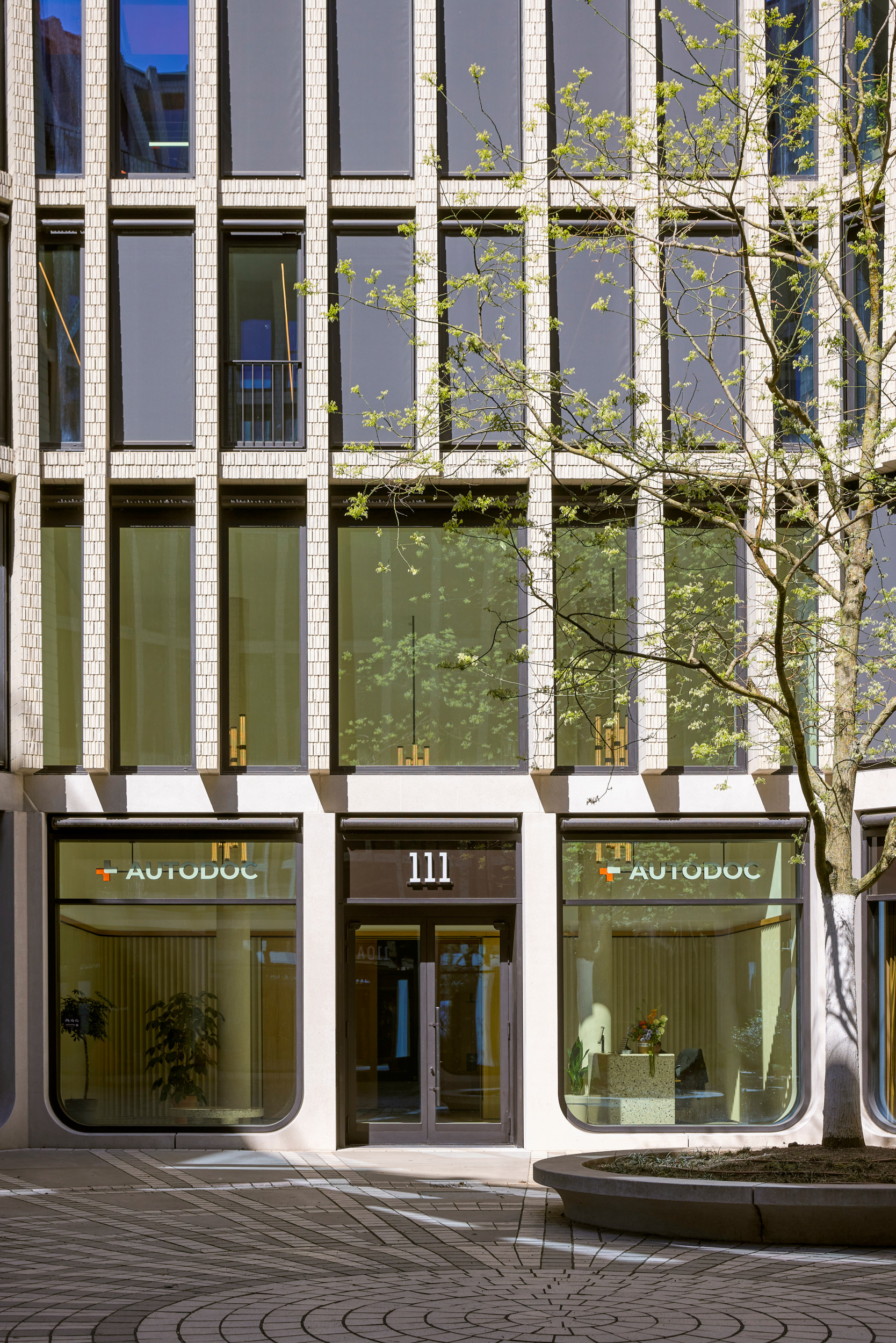
AUTODOC is Europe’s leading digital platform for automotive spare parts and accessories. Millions of end customers and professionals across the continent rely on it every day. When the company brought some of its Berlin-based teams together under one roof at Berlin’s Tacheles, the space needed a language that reflected who AUTODOC is and who it serves.


DESIGN CONCEPT
Made for the makers.
AUTODOC exists because people fix cars every day. Drivers, garage owners, professional mechanics, and hobbyists (DIY) who spend their weekends under a hood. “Hands & Heart” starts there. The spatial concept borrows from the way these people work: tools on pegboards, parts sorted by logic, surfaces that show how they were made. Materials are chosen for honesty. Connections are left visible. Modules fit together the way components fit together. The result is a system that feels built, not decorated. Shaped by the same practical intelligence that drives AUTODOC‘s customers.


material language
The poetry of the workshop palette
The material palette starts where AUTODOC‘s customers work. Then it refines what it finds there. Pegboards, metal elements, and layered surfaces introduce depth, function, and a sense of construction. The origin stays legible, but the finish is architectural. Each element carries the quiet pride of something well made, well mounted, well considered.


WAYFINDING SYSTEM
Crafted, modular, playful.
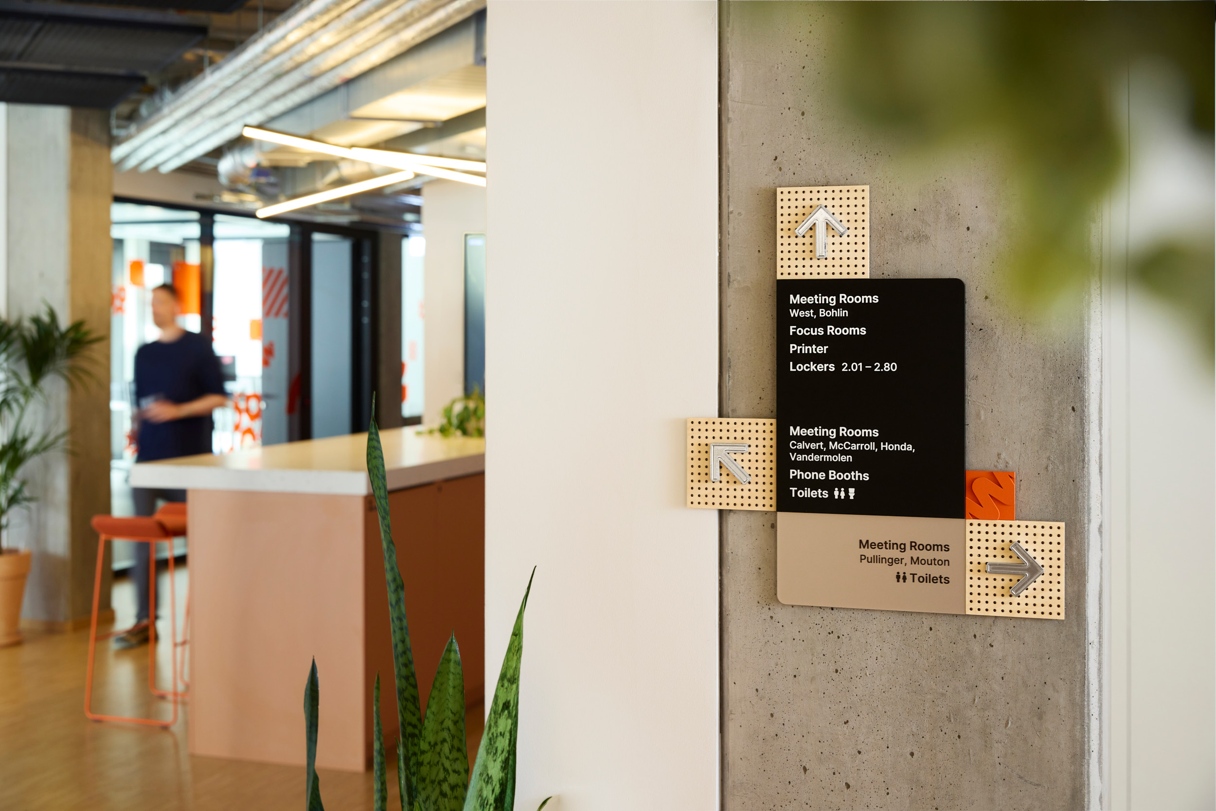
The system operates across scales. Small pictograms in kitchens that make daily routines easier. Wall pictogram signage in corridors that guide you to the right room. Large-format elements that orient across 4000 m² workspace. Each layer guides movement while carrying the AUTODOC brand through the space. Glass surfaces extend the language further, adding rhythm and visibility without visual clutter.


naming system
A story of how the world moves
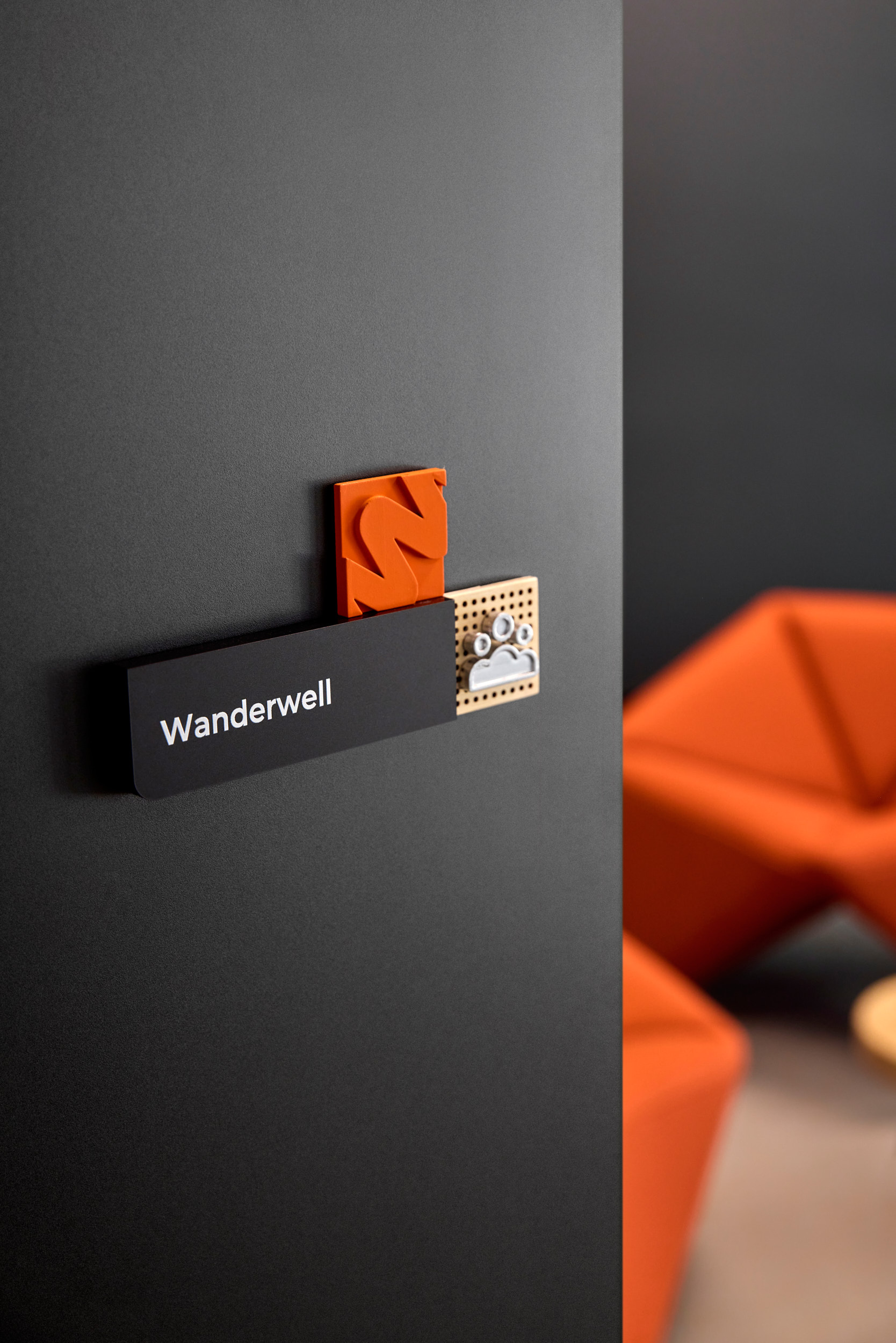
Behind every room name is a moment that changed how the world moves. The engineer who invented the windshield wiper. The first stretch of painted road markings. The female trailblazer who circumnavigated the world in a car. These are not decorative references. They are the milestones that built the industry AUTODOC serves. Across the workplace, navigation becomes a quiet history lesson, one meeting room at a time.

GLASS GRAPHICS
Rhythm for the space.
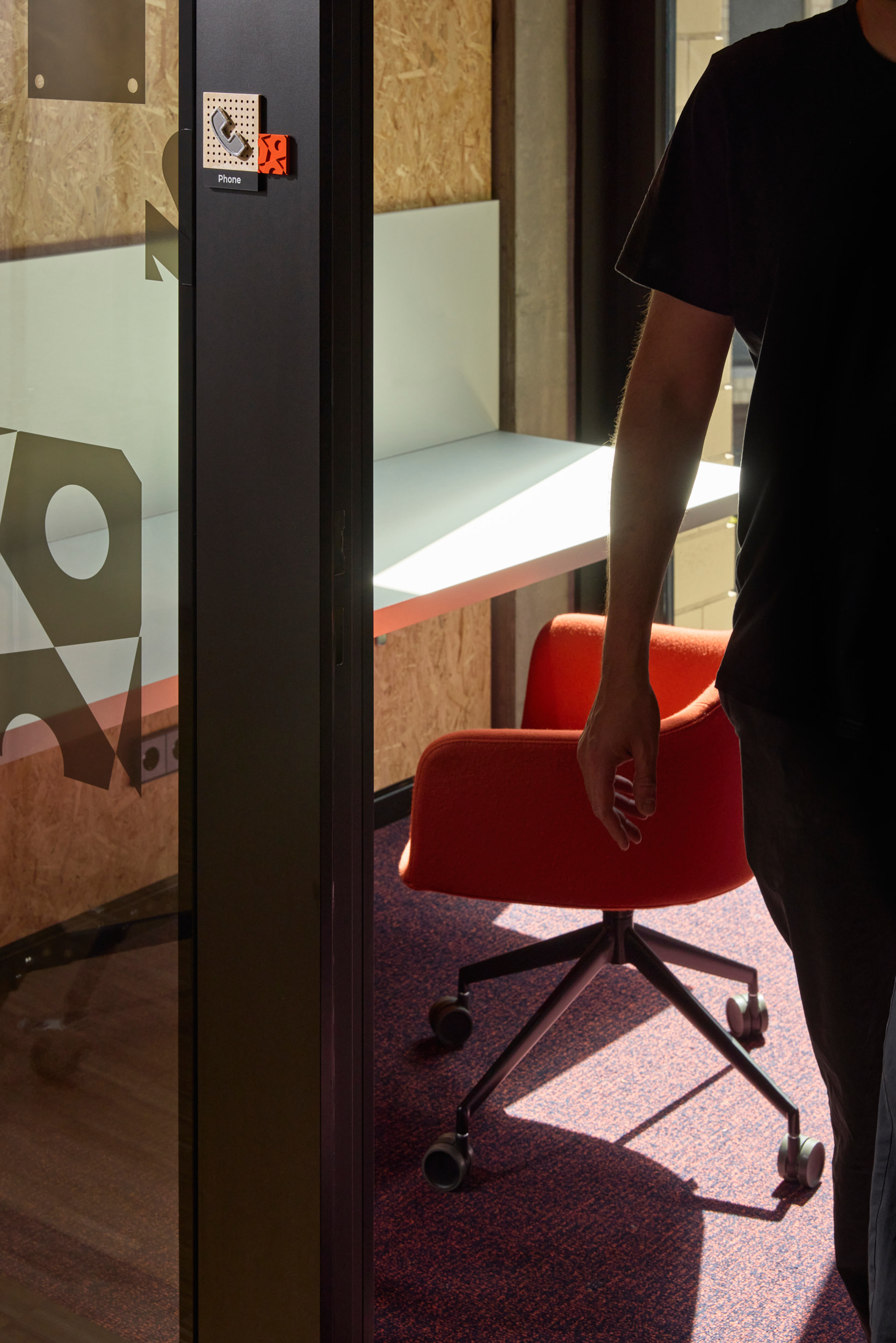
The new space is largely defined by glass: meeting rooms, phone booths, and focus room all framed by transparent partitions. Left untouched, glass disappears, and disappearing glass is a safety problem before it is a design one. The Hands & Heart pattern, drawn from car components and already at work in the signage, was extended onto these surfaces. It marks the glass at eye level so people notice it. It softens the open-plan rhythm without closing it down. And it carries the brand quietly through the floors that signage cannot reach. One vocabulary, two materials, the same logic.



outcome
All hands. All heart.
A workplace at this scale could easily feel anonymous. AUTODOC doesn’t. What holds it all together is not a brand guideline but a spatial language of care, passion and craftsmanship that people absorb without effort.
Get In Touch
Looking for the right language for your space?
We help spaces speak to the people who use them.